






Website by 
Resources
Choosing Paint Colors That Actually Work in Rochester's Light

Here is a scene that plays out in every Rochester home in November. You picked a beautiful warm white in a July showroom, painted the living room, and now, under a low gray sky at three in the afternoon, it looks faintly green and vaguely institutional. Nothing is wrong with the paint. The light changed.
Colour is not a property of paint. It is what happens when light hits paint, and Western New York gives us a very particular kind of light for a large part of the year. Choosing colour here needs a slightly different approach than choosing it in a place with reliable sun.
What Our Light Actually Does
Three things about Rochester light drive most colour disappointments:
- Overcast skies are common for months. Cloud-filtered daylight is cooler and bluer than direct sun. It pushes colours toward their cool undertones, which is why a white with a green base reads clearly green in December and looked perfectly neutral in a sunny showroom.
- The days are short. From November through February you are seeing your rooms under artificial light for most of your waking hours at home. The bulbs matter as much as the paint.
- Snow changes everything. A fresh snowfall bounces an enormous amount of cold, bright light through north-facing windows. Rooms that were dim look suddenly luminous and considerably cooler.
Undertone Is the Whole Game
Every colour, especially every neutral, has an undertone: a subtle bias toward green, pink, yellow, blue, or violet. In full sun the undertone hides. In flat gray light it comes forward and takes over.
Practical guidance for our climate:
- Be cautious with cool grays. The gray trend produced a lot of Rochester living rooms that feel cold from November to March. A gray with a warm base, sometimes called a greige, holds up far better here than a blue-based one.
- Warm whites generally beat crisp whites in north-facing rooms, which stay in cool light all day. Save the very clean, bright whites for south-facing rooms that get real sun.
- South-facing rooms can take cooler colours because the warm afternoon light balances them.
- Check the undertone against what is staying. Your floors, cabinets, stone, and trim all have undertones too. Warm oak floors and a pink-based beige fight each other in a way that is hard to name and impossible to unsee.
Test Properly, and Test for Winter
This is the step that prevents nearly every repaint, and almost nobody does it thoroughly.
- Never choose from a small chip. Colour intensifies dramatically at scale. A chip that looks like a soft beige can read as distinctly yellow across a whole wall.
- Paint large samples, ideally two feet square, or use peel-and-stick sample sheets which are excellent for this and leave no mess.
- Put samples on more than one wall. The same colour looks different on the wall facing the window and the wall opposite it.
- Do not paint samples directly onto an existing colour without a white border around them, or the old colour distorts your reading of the new one.
- Look at them across a full day and into the evening, under your actual light fixtures, on a sunny day and a gray one. In Rochester, the gray day is the important test, and it is the one people skip in summer.
If a whole-house palette feels like too many decisions, that is exactly the sort of thing worth handing to a designer. Talk to Ember Works about your project and we will help you land a colour scheme that works with your finishes and holds up in February.
Get the Lighting Right or the Colour Cannot Be
Because we spend so much of the year under artificial light, bulb choice is effectively part of colour choice.
- Colour temperature. Warmer light in the 2700K to 3000K range flatters most interior colours and feels domestic. Cooler, bluer light makes warm colours look muddy and neutral rooms look clinical.
- Colour rendering. A high colour rendering index means colours look true. Cheap LEDs render poorly, and a beautiful paint colour under a bad bulb looks like a different, worse colour.
- Be consistent. Mixed colour temperatures within one sightline look like a mistake even to people who cannot say why.
- Dimmers everywhere. A room at breakfast and the same room at nine at night want different light levels.
Sheen, Trim, and Older Walls
Sheen is a functional decision as much as an aesthetic one. Flatter finishes hide imperfections beautifully, which matters enormously on the century plaster in Rochester's older homes, but they are harder to clean. Higher sheens wipe down easily and are right for kitchens, bathrooms, trim, and doors, but they show every ripple and patch in an old wall. Eggshell and satin are the workhorse middle ground.
On trim, the traditional approach is a crisper white than the walls in a higher sheen. In a period home, though, consider that original woodwork was often stained rather than painted, and painting good original oak or chestnut is a decision that cannot be comfortably undone.
Choose for the Season You Dread
The simple rule that saves the most repainting: pick your colours in the worst light your house gets, not the best. If a colour looks good on a gray Rochester afternoon in a north-facing room, it will look good all year. If it only sings in July sun, you will spend the winter not liking your walls.
As a design-build firm, Ember Works builds colour and lighting decisions into the design phase alongside finishes, so the palette works with your floors, cabinets, and fixtures rather than against them. Our team, with 60 plus years of combined hands-on experience, also handles the surface preparation and plaster repair that determine whether a paint job looks flawless or merely new. Ember Works designs and builds renovations across Rochester, Monroe County, and Western New York.
Ignite Your Home's Potential with Ember Works!
Call us today: 585-465-1674
Contact Us: www.emberworksroc.com/contact-us
Ready to Start Your Kitchen or Bathroom Project?
Ember Works is a design‑build firm in Rochester, NY. Our designers and our build team work under one roof, so you get a realistic budget before anything is drawn and one team accountable from the first sketch to the final walkthrough. We design and build custom kitchens and dream primary bathrooms across Rochester, Monroe County, and Western New York, backed by 60 plus years of combined hands-on experience.
‹ Back
Recent Posts
-
Choosing Paint Colors That Actually Work in Rochester's Light
September 22, 2026
-
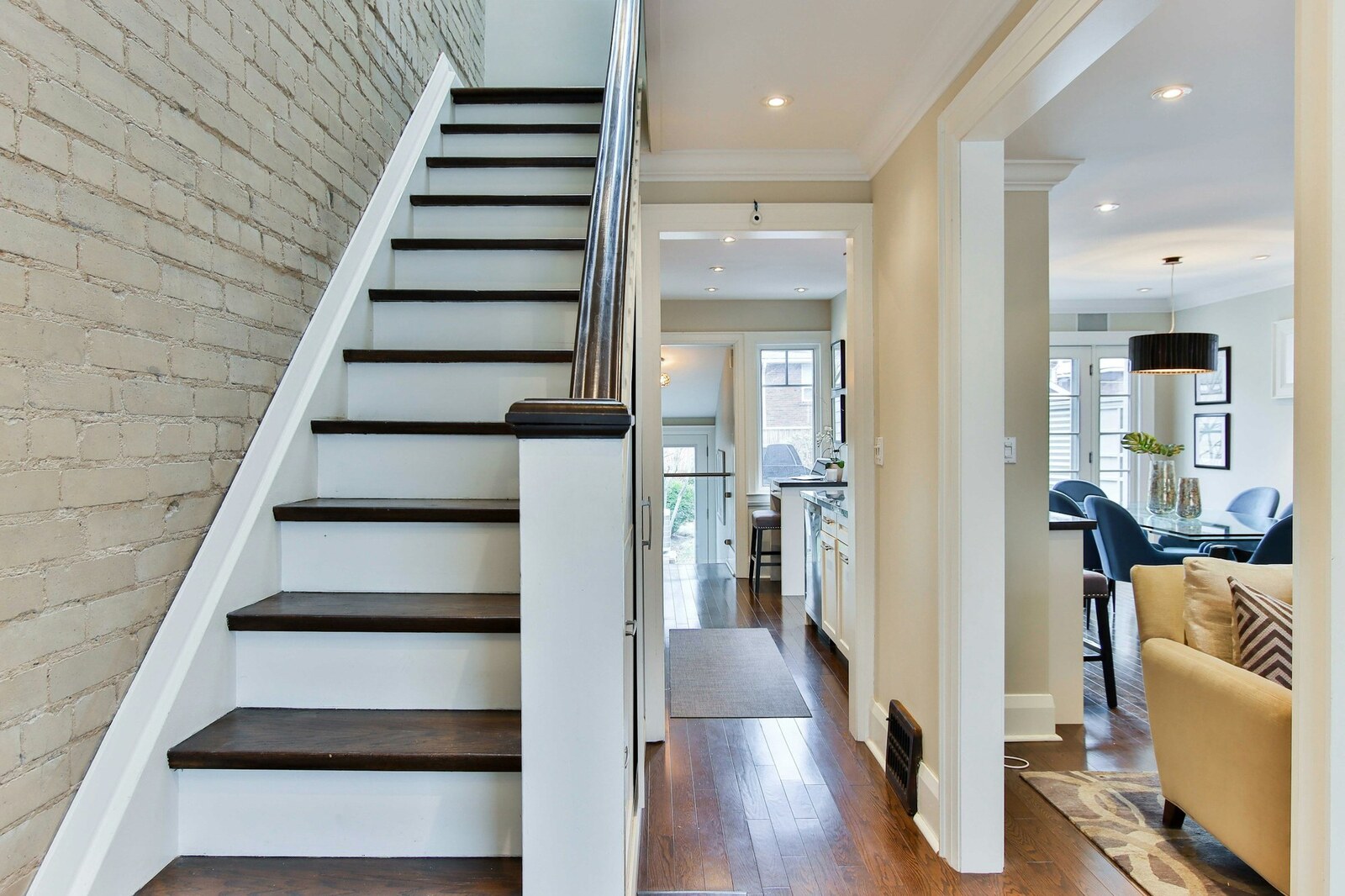
Interior Stairs and Railings: The Feature Hiding in Plain Sight
September 19, 2026
-

Kids' Bedrooms and Nurseries: Remodeling for a Growing Family
September 16, 2026
-
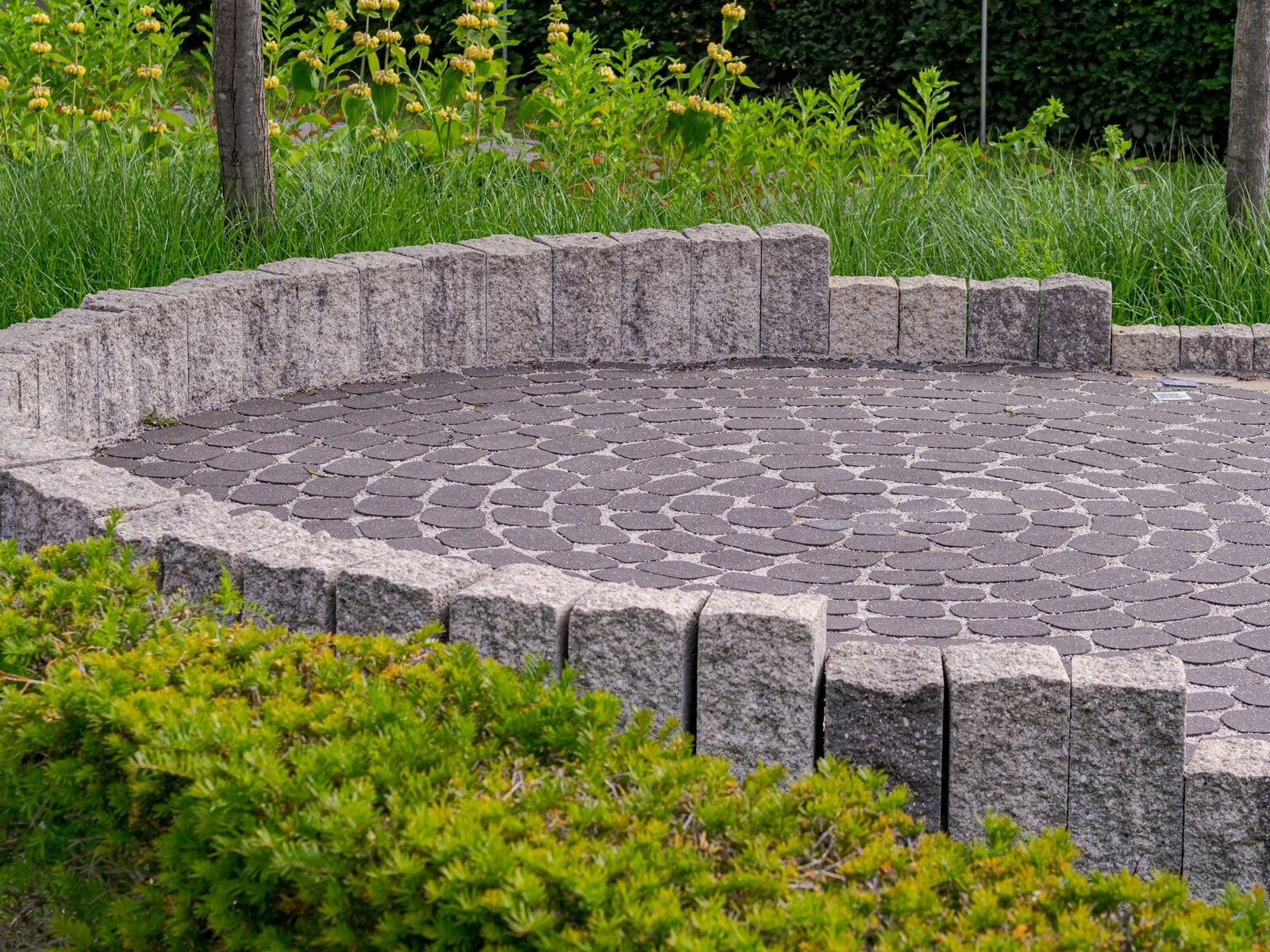
Patio or Deck? Choosing the Right Outdoor Surface for Your Yard
September 13, 2026
-
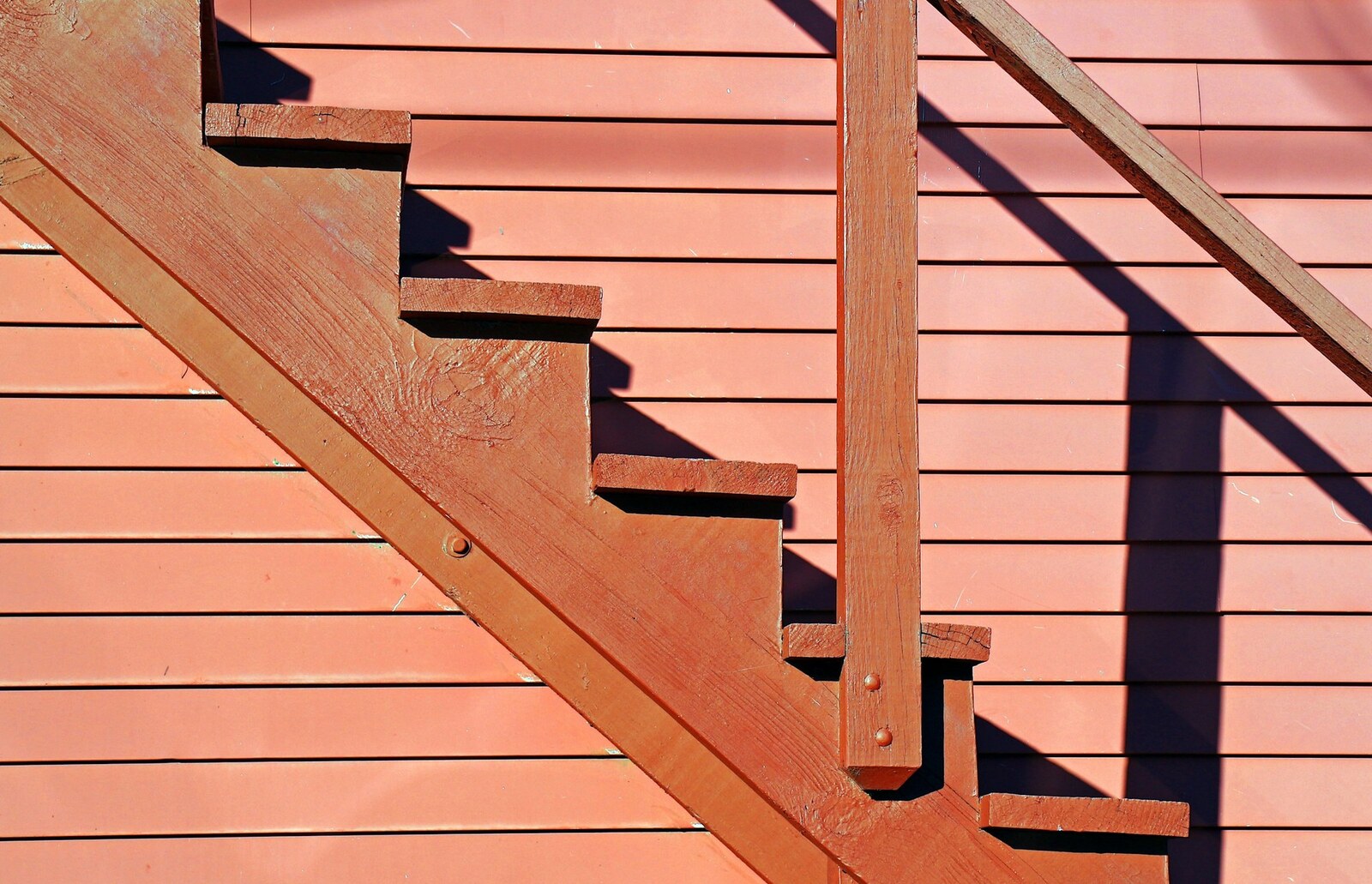
Deck Stairs and Access: Safety, Code, and Getting the Rise Right
September 10, 2026